


Identity Packaging Website Collateral Email
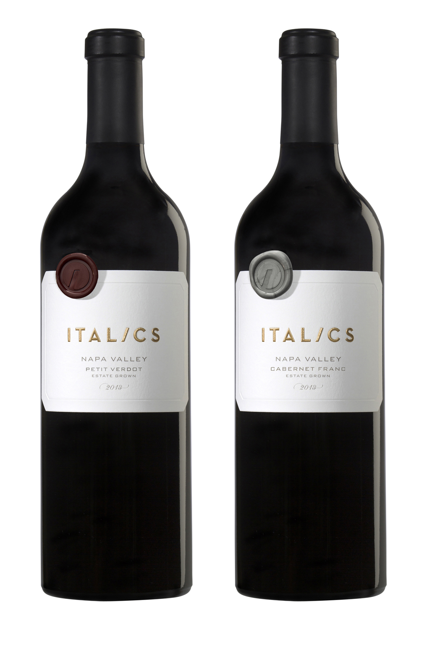
Italics is a pretty conceptual name for a winery. It’s not flora or fauna. It’s not topo- or geographical. It’s not a critter or somebody’s last name. It’s an idea. And the idea is that this is a special place, one worth paying attention to.
Given that, we decided the best approach was to simply frame the name on the label. The paper is incredibly thick so the embossing looks like it’s chiseled out of stone. The gold foil-stamping catches the light just so. The wax seals give it a hand-crafted feel. And the glass is suitably heavy. It’s exactly what a modern luxury brand is supposed to look like.
We were asked to build this website while the winery was under construction. That was a year ago and the winery is still under construction. Good thing we pushed the client not to put up a temporary, half-baked site but rather to use this assignment as a way to envision what the winery might actually become.
With nothing to point the camera at – no tasting room, torn-up vineyards, half-finished caves – we decided instead to tell “stories.” Each story presents the winery in microcosm. Through its History, Hospitality and Winemaking, we learn about the winery’s values and offerings.
© 2024 Ayala Studio