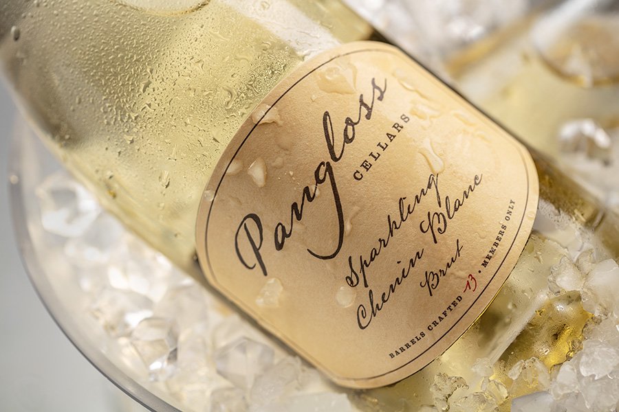
Pangloss Cellars
Identity | Packaging
The identity and packaging was inspired by the 1759 book Candide by Voltaire.The philosopher Pangloss is an eternal optimist, believing this world is “the best of all possible worlds”.
Taking cues from the centuries old book, we created a label design replicating it so closely you can see text bleeding through from the opposite side of the page, including a torn edge as if ripped from the spine of the pocket sized book. The Pangloss logo is in script as if scribed from Voltaire’s own fountain pen.
For their member-only wines, we took a more simplified approach with the same aged paper and all script, but this time including the number of barrels crafted in red. This more contemporary approach families nicely but also stands well on its own.


© 2026 Ayala Studio
