


Identity | Packaging
Texture is known for producing outstanding Pinot Noir and Chardonnay, presented in their elegant Sonoma Square tasting room. More recently they have added Blanc de Noirs and Blanc de Blancs, equally note worthy.
Texture refers to the way the wine feels in your mouth. It can be smooth, coarse, creamy, waxy, velvety or silky.
The name inspired a unique label approach, letting texture define the design. An all white label with a variety of blind embossed textures, letterpress printing on extra thick paper defines the brands upscale look. Subtle enough to grab your attention.
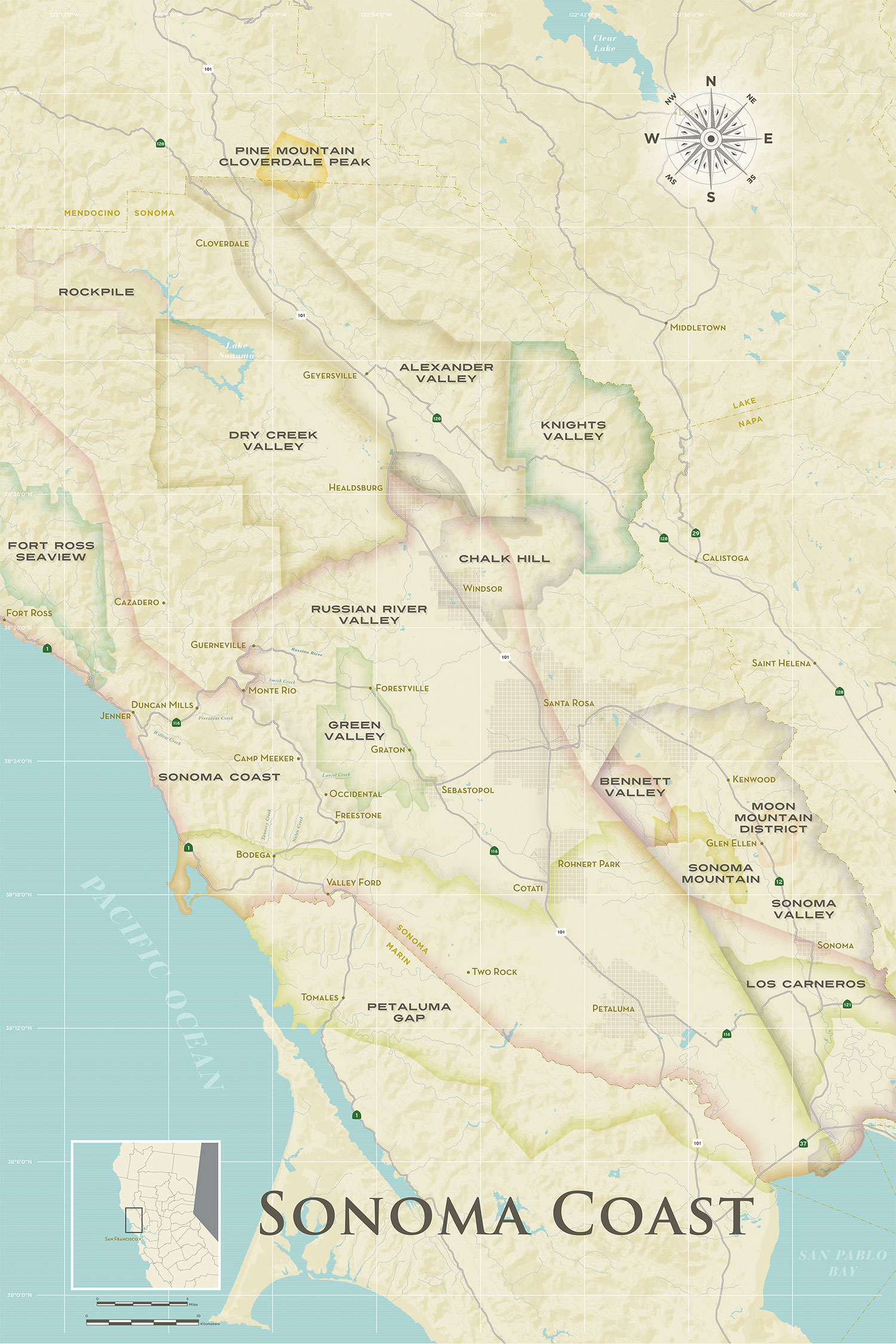
Maps
For their elegant tasting room on the Sonoma Square, we designed maps that became art, well worthy of framing. These pieces illustrate the similarities between their vineyards to those in Burgundy.
© 2024 Ayala Studio